I'm walking down the street with my boyfriend. We're about to pick up dinner at one of our favorite Thai places in Seattle. This is the time we usually talk to each other about books we're currently reading, things we need to do, and personal projects. He's a web developer and oftentimes some of my best design inspiration comes from outside the field of learning. I ask him what he's working on. His response is “Oh, our designer is currently working on moodboards for our next project.” That's when I learned about moodboards. So, what is a moodboard?
Moodboards are used to collect design ideas prior to mocking up a design. Each of the elements in the moodboard will come together to make up the whole mockup of your project. After you have created a moodboard you will begin the mockup of your project.
What Might Encompass Your Moodboard For A Digital Learning Project?
- Fonts
- Color schemes
- UI elements such as: Overall layout, menus, cards, and forms
- Pictures
- Icons
- Interaction ideas
- Inspiration for animation, video, and other multimedia
- Examples or snippets of other projects
What Are The Benefits Of Using Moodboards?
- They are a great way to convey the design and collaborate with others on the design of the project.
- If you're stuck in a design block, creating a moodboard can help you to get started.
- They help you accelerate the mockup process because you will already know what elements you want to use; all you have to do is put them together!
- You will create designs that are timely and unique. Since you won't be stuck on using one design, you're not relying on the same old template you always use. You look for inspiration from multiple projects that will fit your project.
- Ιt's not “work.” Moodboards have become one of my favorites parts of projects. You can get really creative. I have found that they have re-energized my project's design and engagement.
What Does A Moodboard Look Like?
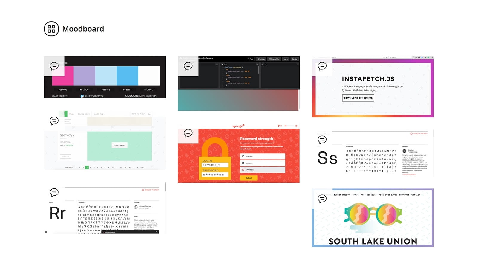
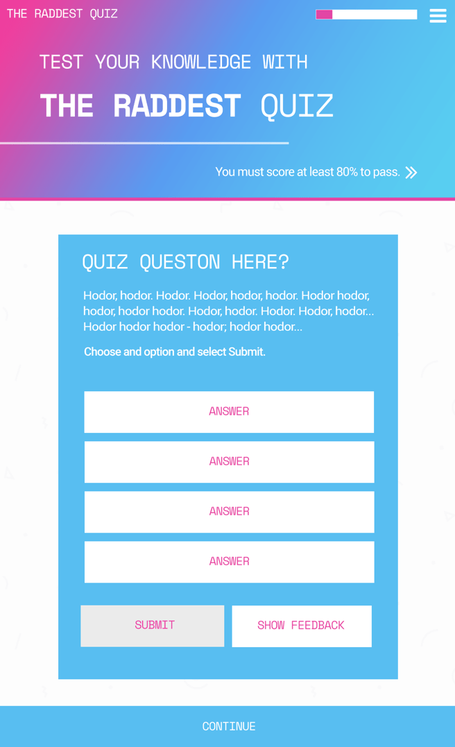
I often work on personal projects to help develop my technical skills. I created a moodboard for a quiz template I made in my spare time. Since my project was going to be rather simple, my moodboard isn't overflowing with content. I added some fonts to my moodboard that I chose from Google Fonts. I really liked the look of mono type on a project I had seen and found a header font that looked similar. I found inspiration on CodePen for an animated gradient background. There is a really nifty site for a block party that happened in Seattle. I wanted to emulate the design, so I chose to use a light pattern in my background and the animated gradient also comes from that design. I got the pattern from Subtle Patterns. I really liked the quiz section of one of the showcase examples for Adapt Learning. I chose to make my whole project a quiz because of the quiz part of the example.


You can see the full moodboard I made for the project over on Go Moodboard and a demo of the quiz template here.
How Do I Get Started Moodboarding?
There are many free resources for creating moodboards, check out some of the following:
- Go Moodboard (This is what I used for my project)
- Niice
- The Matboard
You can also go with someone like Pinterest for creating moodboards or come up with your own solution.
Where Can I Find Resources On UI Design?
Here are a few resources to help you find great UI designs.
- Collect UI
- Collect UI is a collection of UI snippets like cards, sign-up forms, and even onboarding. New designs are added daily.
- Dribbble (Specifically searching for UI)
- Dribbble is a community for designers to share their work. Not only are there UI examples but tons of other multimedia example like animation, logos, and 3D designs.
- PatternTap by ZURB
- ZURB describes PatternTap as a “gallery of specific design and interaction patterns meant to inspire your design work”.
How Can I Learn More?
LinkedIn Learning has a course on moodboards. I have yet to take this course but I have it bookmarked for later this year.
Happy moodboarding!
— Mel
